
RASKH
BRAND.
Role
Brand Identity & Visual System
Client
RASKH
“QUALITY BUILDS TRUST.”
Established in 2004, RASKH is a Saudi real estate company specializing in real estate development, real estate marketing, and property management.
The Challenge
Overview
RASKH operates across several interconnected areas of the Saudi real estate sector, from development and marketing to property management. Its portfolio includes diverse real estate projects spanning commercial, residential, and logistics environments, creating a need for a brand identity capable of representing this breadth through one consistent visual language. The identity needed to establish a recognizable signature for RASKH while remaining adaptable across different communication formats and applications. It also needed to reflect the qualities the company places at the center of its work: quality, professionalism, innovation, efficiency, and trust.
Summary
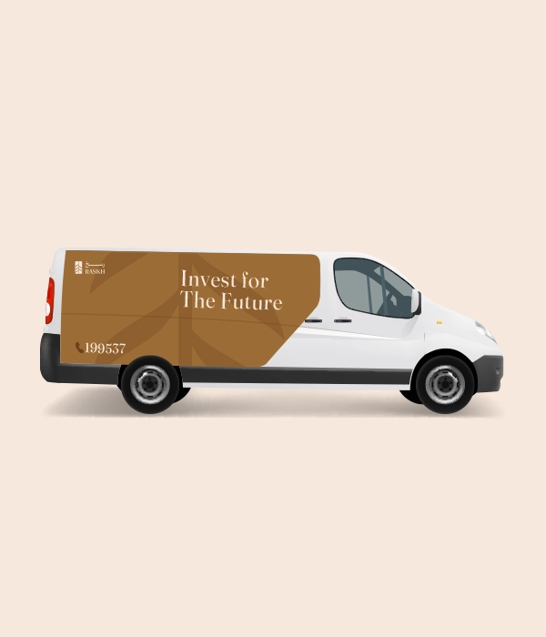
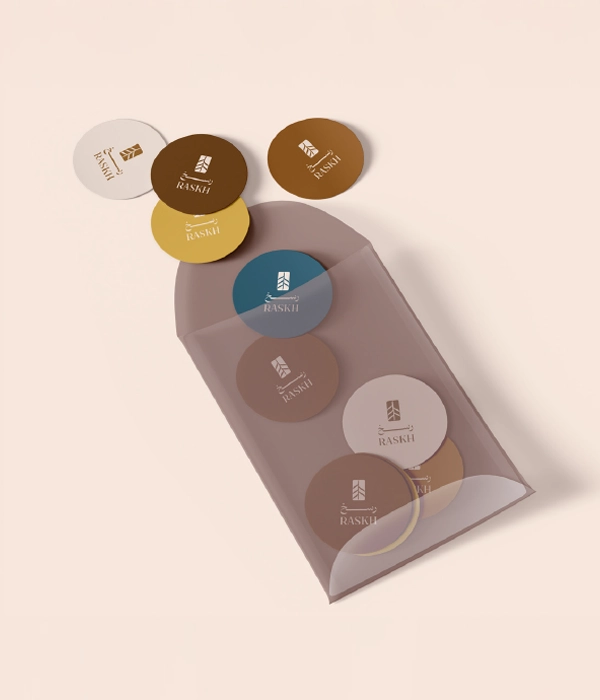
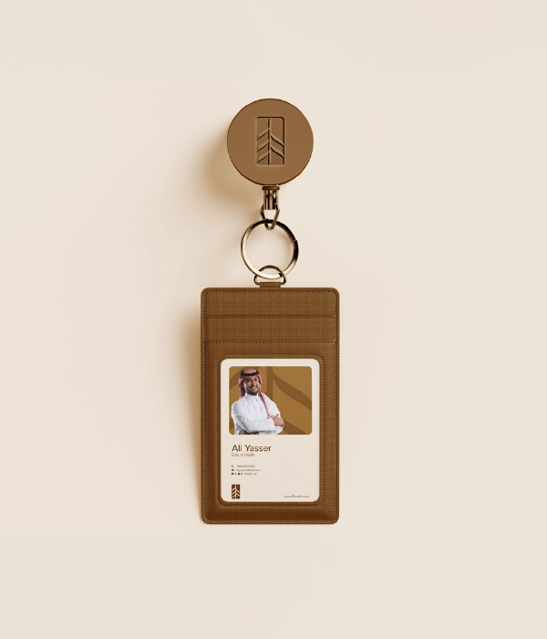
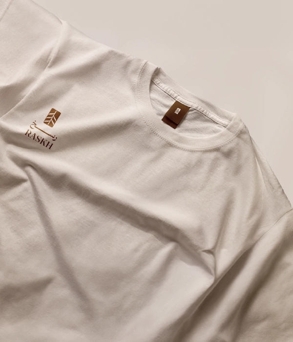
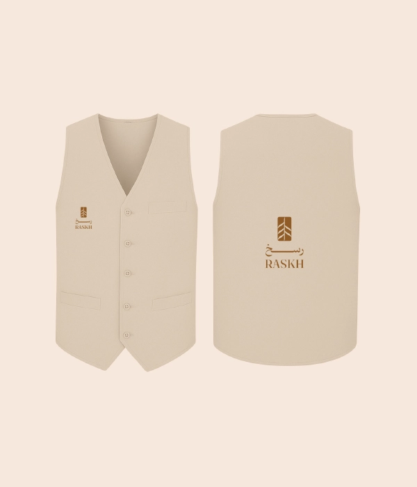
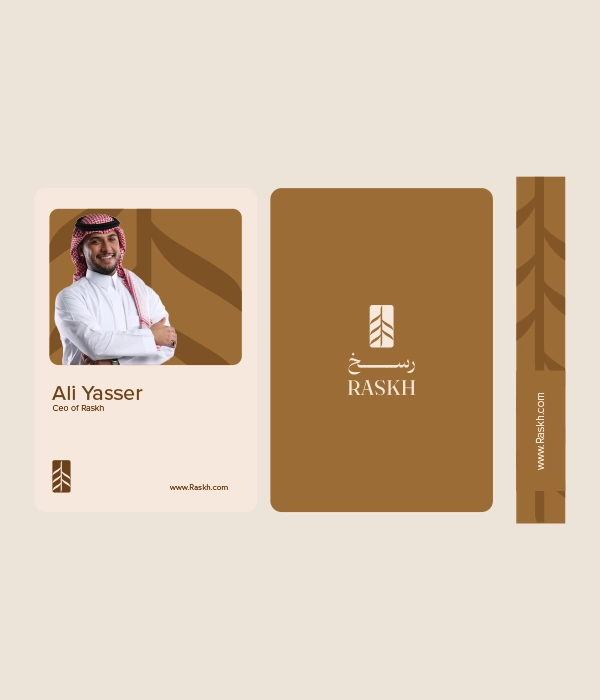
Seven Dimensions developed a comprehensive visual identity for RASKH, establishing the core elements required to create a distinctive and consistent brand presence. The scope covered logo direction, typography selection, color palette development, and key visual elements, then translated the identity into core brand applications across both print and digital environments. The resulting system gives RASKH a strong visual signature that can work across corporate communication, real estate marketing, project materials, and digital brand experiences while maintaining a cohesive and recognizable presence.


Logotype & Glyph Grid


RASKH Color Palette
Dark Gold
White
Black


Atmospheric Spatial Luxury
Holistic Brand World


Visual Contact Sheet
The Impact
+0.
Creative Assets.
+0.
Brand Touchpoints.
0.
Guideline Pages.
+0.
Brand Applications.

Next Case Study